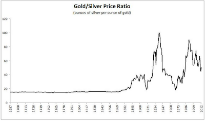
Let's start with the technicals. A pretty concerning picture for silver can be witnessed on the gold-silver ratio chart (Chart 1). You can see that in mid 2010, silver started to outperform gold until mid 2011. During that period, silver went from $US 18/ounce to $US 50/ounce (Chart 2). But recently, the silver price underperformed the gold price, with the gold-silver ratio going back to 60.
 |
| Chart 1: Gold - Silver Ratio |
 |
| Chart 2: Silver Price |
 |
| Chart 3: Long Term Gold - Silver Ratio |
The fundamentals of silver are getting better and better every day. Concerning the depletion of silver, the New Scientist forecasted in 2005 that silver would be depleted in about 15-20 years. This means today we have only 10 years of silver left. Unlike gold, silver is being consumed as it is used in many applications. After consumption, the silver will be thrown together with its applications into land fills and will never be recovered. You could argue that silver can be recycled, but studies have shown that the recycling of silver is not feasible below a price of $US 50/ounce.
Silver scrap is a very important factor in supplying the silver to the markets because it comprises 22% of total silver supply. Since year 2000, the silver scrap to silver supply ratio has been steadily declining. Only just recently in 2011 we saw a spike in the silver scrap to silver supply ratio to 24.7% (Chart 4). This spike is due to the record high price of silver in 2011 ($US 50/ounce), which spurred investors to recycle jewelry and silverware. I expect this number to come down in 2012 as the silver price has been correcting.
 |
| Chart 4: Silver Scrap to Silver Supply ratio |
Events like the offering of the Sprott Physical Silver Trust add to the velocity of depletion as investment demand will take silver supply out of the market. Manipulation of bullion banks to decrease the silver price only adds to the demand of investors to buy silver. We see this in the Silver Institute's 2011 report on silver demand/supply. The demand for silver coins went up an astonishing 18%.
On the net short positions of silver I want to make clear to investors that we are approaching a decade low in the Large Commercial Net Short positions (LCNS). Historically, when LCNS goes up, the price of silver goes with it. Basically this means that a huge spike to the upside is imminent.
| Chart 5: LCNS silver |
On the COMEX silver front we note that registered silver went up from 29.0 million troy ounce (25 April 2012) to 38.7 million troy ounce today, indicating that physical silver has been stocked in COMEX warehouses. Total silver inventories rose from 140.6 million troy ounces (25 April 2012) to 144.4 million troy ounces today (Chart 6). Rising stocks typically mean that there is less demand for silver, declining stocks typically mean there is more demand for silver. On chart 6 we see that stocks had been slowly rising in the previous months (less demand), but more recently, the stock has been declining again since the start of July 2012. Demand is picking up again due to seasonal strength in precious metals (month of July).
 |
| Chart 6: COMEX silver stock |
On the more fundamental side of the economy we noted a very interesting event in the deposit facility of the ECB. Overnight deposits declined by more than half due to the ECB deposit rate cut. This 500 billion euro will basically find its way somewhere, possibly in the precious metals market.
Conclusion: It should be a very good time to invest in silver.


0 comments:
Post a Comment