


BrotherJohnF explains open interest here:
Showing posts with label Interest. Show all posts
Showing posts with label Interest. Show all posts
Wednesday, 26 June 2013
Friday, 3 May 2013
This page is created to monitor the U.S. Interest Payments as a Percentage of Tax Revenues.
One metric that the U.S. government can never manipulate is this ratio. You can apply hedonic adjustments to inflation numbers, you can calculate GDP differently, but you can't falsify the amount of interest payments on government debt and you can't falsify tax revenues.
This ratio measures the affordability of government debt. A spike upwards means that the country is having difficulties servicing its debt load. This can have many causes, like higher yields on bonds, higher public debt or lower tax revenues.

Wednesday, 17 April 2013
The latest articles say that the LBMA, COMEX are going to default in the next few weeks. What is all this fuss about?
Open interest is the total number of options and futures contracts that are not closed on a particular day. If someone opens a call on silver on the futures market, then open interest increases by 1. If open interest is increasing at a rapid pace, that means there are a lot of traders on the futures market making calls (long) and puts (short).
Apparently the open interest in silver is at record highs while the silver price is dropping. This is not normal because normally the open interest should decline. But let's first ask ourselves, what is open interest?
Open interest is the total number of options and futures contracts that are not closed on a particular day. If someone opens a call on silver on the futures market, then open interest increases by 1. If open interest is increasing at a rapid pace, that means there are a lot of traders on the futures market making calls (long) and puts (short).
The key metric to watch here is the following:
When open interest is increasing, it means that the price trend in silver will keep going up/down.
When open interest is decreasing, it means that the price trend in silver will reverse the trend.
So what do we have here? We have an increasing open interest in silver, with a declining silver price. That means the drop in silver price is likely to keep going lower as shorts are creating more and more short positions. Once the open interest trend changes, then we will see a reversal in the silver market to the upside.
 |
| Chart 1: Silver Open Intrest |
So we have a huge battle in the market with a huge increase in short sellers. That increase in open interest is also found in the total stock at COMEX silver (Chart 2). You see the total stock in green is at record highs, while the real physical available silver in blue is not increasing. How can it be that we have so little physical silver in storage for delivery at the COMEX, while trading is so high? If somehow 10% of the longs start to ask for their silver delivery, the COMEX will default. And the chance of default will go up if the open interest keeps increasing. Keep watching the blue line (registered physical silver) as it goes down.

Saturday, 22 December 2012
I haven't looked at this possible correlation yet, but thanks to "goldbug" who reminded me here, I just decided to take a look at this possible correlation.
Apparently, they do correlate. When open interest skyrockets it's mostly because of the increased net short position of large commercials.
That makes life simpler, you just have to look at the open interest which is given each week on the 'GotGoldReport' site, and you will automatically know whether net short positions went up or not.
If open interest is high, you can be sure that silver will sell off.
Apparently, they do correlate. When open interest skyrockets it's mostly because of the increased net short position of large commercials.
That makes life simpler, you just have to look at the open interest which is given each week on the 'GotGoldReport' site, and you will automatically know whether net short positions went up or not.
If open interest is high, you can be sure that silver will sell off.
 |
| Chart 1: Open Interest Silver |
 |
| Chart 2: LCNS Net Short Positions Silver |
Tuesday, 4 December 2012
I was curious on how much of U.S. tax payer revenue was going to interest payment on government debt at this time compared to history and surprisingly the U.S. is doing very well.
If we were to have the interest rate of 1991 today (7% for 10 year U.S. bonds). I bet we would be higher than 26% already. It would be as much as 50% of tax revenue according to Michael Pento. It all depends on the interest rate (which of course is never going to go up).
So all the hype about tax revenue that goes to interest payment (touted by Marc Faber) isn't as hot as it may actually sound.
To compare with Japan:
For Japan we have 22 trillion yen in interest payments. http://yhoo.it/MCWrdj
Versus
42 trillion yen in tax revenue. http://bloom.bg/11OIYoC
That's indeed 50% which is very high.
If the Japanese 10 year bond yield doubles, the interest expense will also double. Which makes Japanese people pay their taxes all to interest on debt.
But, Japan has a current account surplus..., which the U.S. doesn't have.
And the interest payments will stay in Japan and circulate in their economy.
Tax revenue data came from here and is at almost $3 trillion annually ($2.683 trillion to be exact).
Interest expense on debt data came from here and is at $400 billion.
If we just divide those two then we get chart 1.
If we just divide those two then we get chart 1.
And yes, surprisingly, the interest payment to bond holders is going down compared to the tax revenue the federal government is getting today. Historically, we had the highest interest payment to revenue ratio in 1991, which was 26%. Of course, the interest rate was much higher then.
 |
| Chart 1: Interest Expense to Federal Receipt Ratio |
So all the hype about tax revenue that goes to interest payment (touted by Marc Faber) isn't as hot as it may actually sound.
To compare with Japan:
For Japan we have 22 trillion yen in interest payments. http://yhoo.it/MCWrdj
Versus
42 trillion yen in tax revenue. http://bloom.bg/11OIYoC
That's indeed 50% which is very high.
If the Japanese 10 year bond yield doubles, the interest expense will also double. Which makes Japanese people pay their taxes all to interest on debt.
But, Japan has a current account surplus..., which the U.S. doesn't have.
And the interest payments will stay in Japan and circulate in their economy.
Saturday, 25 August 2012
5 months after I wrote the article about the Euro Vs. the USD, it looks like the USD has won the match against the euro. Since April 2012, the euro has lost 5% against the USD. Let's look at what has changed in those months.
Following list gives the most important indicators for the future of a currency:
The larger the national debt of the country, the more expensive it will be to sell debt to foreigners. The government will then be obliged to monetize this debt to keep interest rates low and to be able to service this debt. Rising debt load will therefore devalue the currency.
The higher the inflation rate, the lower the currency will go. An example is Vietnam, where the dong lost much of its value due to high inflation.
When interest rates are lower than the inflation rate, there is no incentive for foreigners to buy the currency. There is no incentive to save money. The consequence is a lower currency value.
Let's look at the current statistics:
1) Current account
5 months ago, the current account deficit of the US was in the order of $US 110 billion per quarter, which amounted to $US 450 billion per year (2011).
For the Eurozone, the 12-month cumulated seasonally adjusted current account recorded a deficit of EUR 44.9 billion.
Today, the eurozone is posting a current account surplus of 14.9 billion euro in June, while the U.S. is increasing its quarterly deficits to $US 137 billion in the latest quarter.
So in this case, the eurozone is still the winner.
Europe VS USA: 1-0.
2) Total National Debt
Total US national debt is $US 16 trillion. Total eurozone national debt to GDP is 88.6%, the GDP is $US 17.578 trillion in 2011, which translates to $US 15.6 trillion in Eurozone debt. So again, Europe wins by a small margin.
Europe VS USA: 2-0
3) Inflation Rate
5 months ago, the inflation rate in the Eurozone was 2.6%, while the inflation rate in the U.S. was 2.9%. Today the inflation rate in the Eurozone is 2.4%, while the inflation rate in the U.S. is 1.4%. This is a significant and surprising decline in inflation rate in the U.S Vs. Europe.
Europe VS USA: 2-1.
4) Interest Rate
5 months ago, the interest rate in the Eurozone was 1%, while the interest rate in the US was essentially zero. As we already know, Mario Draghi lowered interest rates to 0.75%, but this is still higher than the interest rate in the U.S. (0.25%). Europe VS USA: 3-1
Conclusion: Europe still wins by 3-1 against the USA, but is losing ground through inflation. Though I think the current account surplus of Europe is the most important positive indicator of the strength of the euro in the future.
Following list gives the most important indicators for the future of a currency:
- Current account balance of the country
- Total national debt of the country
- Inflation rate
- Interest rate
The larger the national debt of the country, the more expensive it will be to sell debt to foreigners. The government will then be obliged to monetize this debt to keep interest rates low and to be able to service this debt. Rising debt load will therefore devalue the currency.
The higher the inflation rate, the lower the currency will go. An example is Vietnam, where the dong lost much of its value due to high inflation.
When interest rates are lower than the inflation rate, there is no incentive for foreigners to buy the currency. There is no incentive to save money. The consequence is a lower currency value.
Let's look at the current statistics:
1) Current account
5 months ago, the current account deficit of the US was in the order of $US 110 billion per quarter, which amounted to $US 450 billion per year (2011).
For the Eurozone, the 12-month cumulated seasonally adjusted current account recorded a deficit of EUR 44.9 billion.
Today, the eurozone is posting a current account surplus of 14.9 billion euro in June, while the U.S. is increasing its quarterly deficits to $US 137 billion in the latest quarter.
So in this case, the eurozone is still the winner.
Europe VS USA: 1-0.
 |
| Euro Area Current Account (Million euro) |
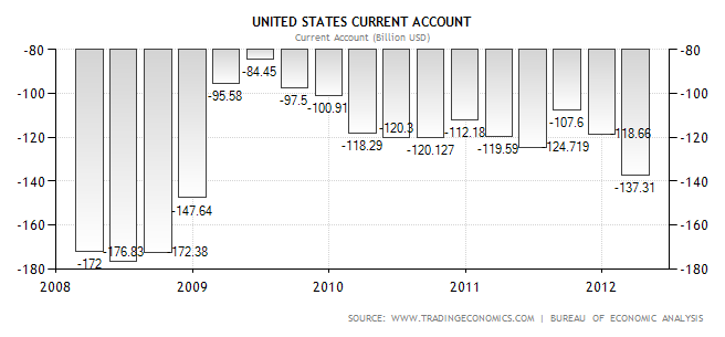 |
| U.S. Current Account (Billion USD) |
Total US national debt is $US 16 trillion. Total eurozone national debt to GDP is 88.6%, the GDP is $US 17.578 trillion in 2011, which translates to $US 15.6 trillion in Eurozone debt. So again, Europe wins by a small margin.
Europe VS USA: 2-0
3) Inflation Rate
5 months ago, the inflation rate in the Eurozone was 2.6%, while the inflation rate in the U.S. was 2.9%. Today the inflation rate in the Eurozone is 2.4%, while the inflation rate in the U.S. is 1.4%. This is a significant and surprising decline in inflation rate in the U.S Vs. Europe.
Europe VS USA: 2-1.
 |
| Euro Area Inflation Rate |
 |
| U.S. Inflation Rate |
4) Interest Rate
5 months ago, the interest rate in the Eurozone was 1%, while the interest rate in the US was essentially zero. As we already know, Mario Draghi lowered interest rates to 0.75%, but this is still higher than the interest rate in the U.S. (0.25%). Europe VS USA: 3-1
 |
| Euro Area Interest Rate |
 |
| U.S. Interest Rate |
Conclusion: Europe still wins by 3-1 against the USA, but is losing ground through inflation. Though I think the current account surplus of Europe is the most important positive indicator of the strength of the euro in the future.
Tuesday, 21 August 2012
Bloomberg reported on 20 August 2012 that banks are stepping up their U.S. treasury buying. As deposits increased 3.3% to $US 8.88 trillion in the two months ended July 31 2012, business lending rose 0.7% to $US 7.11 trillion, Federal Reserve data show. This inherently means that banks aren't lending money to the private sector, but are lending their money to the U.S. government. Peter Schiff pointed this out on the Peter Schiff Show of 20 August 2012. Banks bought $US 136.4 billion in bonds (TLT) already this year, pushing their holdings to $US 1.84 trillion.
Let's take a snapshot of the debt maturities in 2011 and 2012 and quickly compare them (Chart 1 and Chart 2: U.S. treasury debt by Year of Maturity (2012) ) (I talked about debt maturities in this article).
You can immediately see that short term debt has doubled in 1 year time. The biggest buyers of these treasuries were the federal reserve, domestic investors, banks, emerging markets like Japan and China. It's no wonder that bond yields have gone down with all this buying of U.S. treasuries. But these yields have started to rise sharply just recently, topping 1.85% for the 10 year U.S. treasuries (Chart 3).
If you want to know what impact this will have on the banks, go read the full version of this article.
Let's take a snapshot of the debt maturities in 2011 and 2012 and quickly compare them (Chart 1 and Chart 2: U.S. treasury debt by Year of Maturity (2012) ) (I talked about debt maturities in this article).
 |
| Chart 1: U.S. treasury debt by Year of Maturity (2011) |
 |
| Chart 3: 10 year U.S. treasury yield |
If you want to know what impact this will have on the banks, go read the full version of this article.
Tuesday, 10 July 2012
On Thursday 5 July 2012, the ECB cut its main refinancing rate to 0.75% and its deposit rates to 0%. After LTRO I and LTRO II, we have another stimulus to supply credit to the markets.
But it wasn't working out for the markets, because all the money was kept at the ECB deposit facility (Chart 2).
Then, we got the interest rate cut of the ECB, and that lowered the Euribor another step from 0.64% to 0.55% as witnessed on Chart 1 (see the little spike downwards).
So what does all this mean for you? Read the analysis here.
In my previous article on LTRO I, I noted that the Euribor was manipulated lower to make it easy to lend (Chart 1).
 |
| Chart 1: 3 Month Euribor |
But it wasn't working out for the markets, because all the money was kept at the ECB deposit facility (Chart 2).
 |
| Chart 2: ECB Deposit Facility |
Then, we got the interest rate cut of the ECB, and that lowered the Euribor another step from 0.64% to 0.55% as witnessed on Chart 1 (see the little spike downwards).
So what does all this mean for you? Read the analysis here.

Subscribe to:
Posts (Atom)


