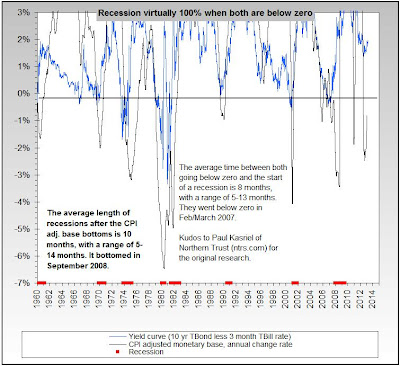
The key is to monitor that the 10 year yield is always higher than the 3 month yield. If the 10 year yield starts to go closer to the 3 month yield and even goes below it, then we have a high probability of a recession.
That correlation can be witnessed on chart 1. Each time the blue line goes below zero, we have a recession.
 |
| Chart 1: Recession Vs. Yield Spread |
The last recession was in 2008. A few years before, the yield spread went to zero. Today we're in pretty safe territory (Chart 2). The green line minus the black line is 2%. If we see the black line go up again or the green line go down, we are in trouble. That's why the Federal Reserve never will increase the fed funds rate. Otherwise the black line will spike upwards.
No problems today. But it pays off to watch the yield spread each month or so.
 |
| Chart 2: U.S. bond yields |
This theory is applicable to every country. I analyzed Spain for example in this article.
| Chart 3: Spanish Bond Yields (10 year vs 2 year) |


0 comments:
Post a Comment