The trade deficit numbers are out for June 2013 and have been very positive. Due to an oil boom, the trade deficit shrank 22% from around $44 billion in January 2013 to $34 billion in June 2013.
As you can see on Chart 1, the decrease in deficit was due to an increase in exports (red chart) and a decrease in imports (blue chart). This looks very promising, but I want to show that not all is well if you look into the details.
 |
| Chart 1: Import Vs. Export |
 |
| Chart 2: Exports January 2013 |
 |
| Chart 3: Imports January 2013 |
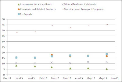
If we then further look at how these numbers evolve in time from January 2013 till June 2013 we have charts 4 and 5.
 |
| Chart 4: Exports (billion USD) |
 |
| Chart 5: Imports (billion USD) |
To continue reading this analysis: go here.


0 comments:
Post a Comment