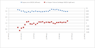
So how do we use these charts to our advantage? I think this: when the red dots go up high (steep contango), it means a bottom should be forming on the copper price (e.g. June 2012 and today). That means the copper price should go up in the future from now. When the red dots are very low (steep backwardation) (e.g. May 2012) you will know that the copper price will go down.
There is science behind this, but we don't need to think about that, we just use correlations to make investment decisions.
That also means, if copper goes up, the stock market will go up. How odd that may sound...


0 comments:
Post a Comment